Derived Statistics

In a follow up to this post I thought I’d explain how I obtained the statistics used.
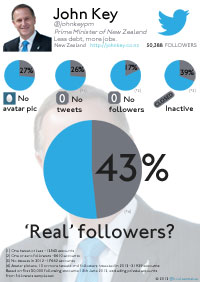
The first indicators were easy to obtain – No Avatar Picture, No Tweets and No Followers and are fairly self explanatory. Obtaining a figure for Inactive Accounts however was a little more difficult. Because Twitter does not return any information (other than a total) for a private accounts tweets, the last_tweet_date was not available for all users. To stop this from skewing the dataset I removed these accounts from the sample size.
| John Key | Clare Curran | Russel Norman | Metiria Turei | David Shearer | Gareth Hughes | |
| Private Accounts | 4269 | 153 | 342 | 284 | 284 | 377 |
| Percentage | 8.5 | 6.3 | 8.7 | 8.3 | 8.9 | 8.9 |
As you can see the percentage of private accounts is roughly equivalent – and not enough to skew our sample.
This gave me a new followers total to calculate averages for tweet related metrics Inactive Accounts and “Real” Followers
| John Key | Clare Curran | Russel Norman | Metiria Turei | David Shearer | Gareth Hughes | |
| No Avatar | 27% | 8% | 11% | 10% | 11% | 6% |
| No Followers | 17% | 1% | 4% | 3% | 4% | 2% |
| Inactive | 39% | 17% | 20% | 19% | 14% | 14% |
| ‘Real’ | 43% | 77% | 72% | 74% | 74% | 80% |
I’ll leave it as an exercise for the reader to interpret accordingly.
NB: These accounts were selected as Leader of the Opposition, Leaders of the Greens, and Clare Curran and Gareth Hughes as they had respectable follower numbers of their own for comparison.
EDIT 18/06/2012
I located a site that can graph followers over time for a Twitter account, sadly the scale of the x-axis is not consistent which tends to cause spikes in growth that wouldn’t normally be visible.
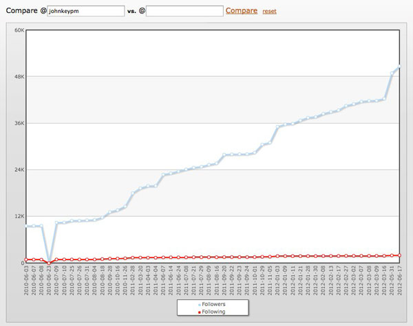 |
As you can see the growth is fairly consistent: the first dip is presumably a statistic gathering error and should be discarded.
As only an idiot would buy followers in large and obviously identifiable quantities (Rudd, Gingrich…Lady Gaga) steady organic looking growth doesn’t mean anything if you’re smart and feed them in gradually. The jump at the end of the graph actually indicates only 375 increased followers a day which could of course easily be attributed to a particularly good press release. (Although I can’t seem to recall any of late) and isn’t a smoking gun by any stretch.
A commenter elsewhere suggested comparing other politicians with 50,000 followers to see how they stack up. Their point may have been purely that we don’t have any…however we do have some celebs and sportspeople who match up. I’ve started the data collection process so we should have some comparisons late today or tomorrow.
UPDATE 21/06/2012 Obtaining additional data for comparison took a lot longer than expected due to unforeseen issues with the Twitter API.
| John Key | Piri Weepu | Corey Jane | John Campbell | Rhys Darby | Helen Clark | |
| Followers | 50,000 | 50,000 | 50,000 | 32,04 | 88,396 | 18,392 |
| No Avatar | 27% | 15% | 20% | 15% | 14% | 11% |
| No Followers | 17% | 10% | 14% | 8% | 6% | 4% |
| Inactive | 39% | 12% | 22% | 2% | 22% | 12% |
| ‘Real’ | 43% | 67% | 56% | 67% | 64% | 79% |
Interesting to see how ‘active’ @johnjcampbell‘s followers are, and that Piri and Corey’s followers are so different given that you would expect them to be followed by similar accounts.
Update 31/07/2012
There has been an application released that people can use to analyse their own accounts called Status People
The tool largely mirrors my own assumptions and subsequent results, but is much more user friendly than the tools I created for my own use.
More discussion in and around the subject is available in this National Business Review article
Derived Statistics Read More »
